
 |
SaaS Model: Stop Me If You've Seen This
Building on previous posts, in the next several issues I'm going to walk through how I built the "SaaS Model" that I'm working on as part of the Ultimate Financial Modeling Mastery Program.
(also, existing students will get the model for free, and I'm planning to release it asap, so stay tuned!)
The "layout" isn't all that different from what you've seen from me before.
That's because I try to build most models in a very similar way:
Output < Model < Schedules < Data
Like I said last week, the biggest differences with SaaS are:
- Custom revenue and expense drivers (that still feed back into the three statements)
- Understanding the Unearned Revenue account (on the balance sheet)
I'll talk through the sections today...
Summary + Assumptions
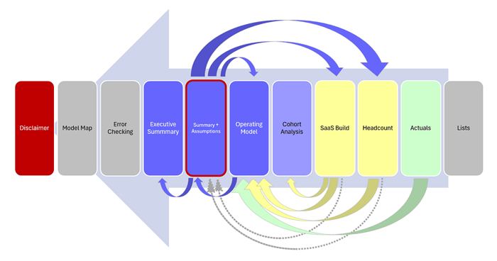
The reason this tab is highlighted in red in the "Model Map" above is because I wanted the entire model to be controllable from one single place.
Now, I know this is really hard to see, but I've copied a snapshot below:
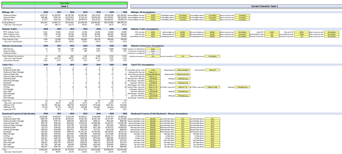 |
The reason I put the Summary and Assumptions together is because I don't like the classic "Assumptions Page" (and I know I may be alone in this view).
However, with the "classic approach," you go to the Assumptions Page, change an input, flip through your model hoping it worked correctly, and then flip back to your summary and try to eyeball the difference.
With this layout (Summary & Assumptions side-by-side), you immediately see the impact of every input you change. I find this is really helpful for stress-testing the model.
To take it one step further, I wanted to make sure you can compare between scenarios:
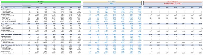 |
This is a great way to see the holistic impact of one assumption change, and also serves as a double-check that your model is actually working correctly.
The reason I want to emphasize this tab is because, despite there being 11 total tabs in the model, I'd say 95% of the model can be controlled from this one Summary + Assumptions tab.
SaaS Model: The Flow of Information
|
I'm not a graphic designer, so you'll have to accept these arrows I inserted in Excel.
Big picture, you can see there is a "looping effect" to the flow of information:
Summary + Assumptions:
Like I said above, I want the model to be almost entirely controllable from this one place. Accordingly, you've got information that flows like this:
- ➡️ Headcount: assumptions about comp, raises, bonus, etc.
- ➡️ SaaS Build: assumptions about contract pricing, billing, churn, website traffic, sales capacity, etc.
- ➡️ Operating Model: assumptions about other expense and balance sheet
The assumptions entered above drive calculations on the Headcount and SaaS Build tabs, the outputs of which flow back to the Operating Model.
Operating Model:
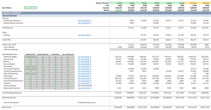 |
Built in the classic, three-statement layout, you can see the Operating Model is the recipient of a lot of information:
- ⬅️ Actuals: actual information (from the chart of accounts) populates the history in the Ops Model
- ⬅️ Headcount: calculations from this tab populate Wages, Bonus, Payroll Taxes, etc. on the Ops Model
- ⬅️ SaaS Build: calculations about Revenue, Billings, Unearned Revenue, etc. flow to the Ops Model
Ultimately, this is what I love about three statement modeling: the structure is the same regardless of industry or company size.
Our custom drivers for Revenue and Expense still flow back into the three statement format, and the statement of cash flows is calculated using the indirect method (just like it would be for an inventory-based company).
SaaS Model Cohort Analysis:
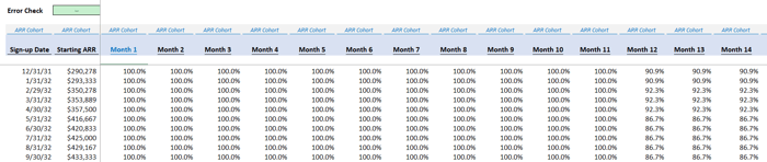 |
A big part of SaaS (but structurally just an output), a "Cohort Analysis" helps you see how well customers are retained over time based on when they signed up for your service.
In the model, I group customers based on month (their "Sign-up Date") and the analysis tracks retention over time. In the image, you can see some "churn" (losing customers) happening in Month 12.
This is very common and happens when contracts are supposed to renew (some customers just decide they don't want to stick around).
Executive Summary:
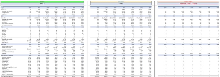 |
On the Executive Summary, only the most pressing line items are shown (in annual format), so we can see the big picture.
This is the "view from 50,000 feet" that your boss loves to mention in random meetings.
Built in the same format as Summary + Assumptions above, we have the ability to:
- See the Current Scenario (green header, left)
- Alongside the Control Scenario (yellow header, middle)
- Analyze the Variance between scenarios (red header, right)
This way, when your boss says, "Hey, what happens if we do [X]?" You have an output that easily illustrates the change.
SaaS Model: Other Sections
Everything else in the model is support-based:
- Disclaimer: obvious
- Model Map: the picture from the start of this email
- Error Checking: tells us what might be going wrong in the file, if anything
- Lists: helps us "tag" certain line items for easy mapping from one tab to another
I know that's a lot to unpack, and of course there's more detail within each tab, but that's the big picture:
Summaries < Three Statement Model < Calculations < Assumptions / Actual Data
I'll dive into more details in future issues.
That's it for today. See you next time.
—Chris
p.s., if you enjoyed this post, then please consider checking out my Financial Modeling Courses. As featured by Wharton Online, Wall Street Prep, and LinkedIn Learning, you'll learn to build the exact models I use with Investment Banks, FP&A Teams, and Private Equity Firms 👉 Click here to learn more.